No products in the cart.

Stefaan Vermeulen
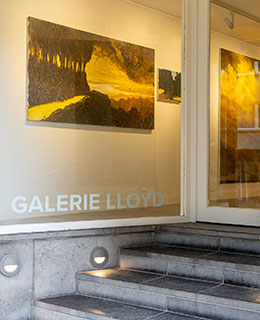
On Colour
Saturday 26/07/2025 — Sunday 31/08/2025
Opening Sunday 27/07/2025 at 16.00,
in the presence of the artist


“I see the world in black and white”
In everyday life, conscious use of colour often has a decorative or symbolic connotation. We consciously choose colours in our clothing or when we are decorating our homes. Marketing makes clever use of the emotional and symbolic effects of colour.
In the work of visual artist Stefaan Vermeulen, colours have no decorative or symbolic meaning. It is not about whether colours match or not, and colour is by no means an expression of ideas or a state of mind. It is the physical properties of colour that matter to Vermeulen.
We do not only refer to the properties of colours by their names, such as yellow, orange, red or purple. We also talk intuitively about dark and light colours, bright and soft colours, or warm and cool colours. In physics, we look at light and colour more objectively: we talk about colour temperature, hue, saturation and brightness. With this knowledge of objective, physical concepts, Vermeulen is working on a colourful oeuvre in which these physical properties are used to create a new reality. In this context, colour does not have a decorative or symbolic meaning, but is used in function of the image itself and that new reality. One could almost speak of a return to the principles of impressionism...
The most important aspect of the physical principles behind colour perception is the brightness of colours. “In my work,” says Vermeulen, “I mainly look at brightness, and therefore grey values – the essence of colour – because that way all colours become interchangeable. It is not about the colour itself, but about the underlying grey tone that forms the basis for harmony and contrast. Moreover, working with grey tones creates the possibility of working with depth, space and colour perspective. Colour is by no means an aesthetic choice, but a strategic tool for shaping a new reality. And so my work, although completely free in terms of colour use, is nevertheless very logical”.
“You pass by it about 25 times a year because it is located along the walking path that starts behind your painting studio. Each time, you pause for a moment to take a closer look, to see what is hidden in and behind those fields and meadows, what colours nestle in the rough bark of a few forgotten trees or in their empty, windswept crowns. And as you stand there looking, bluntly with your brightly coloured walking shoes in the muddy tracks of the footpath, you’re tempted to assume that those grasslands and the horizon are looking back at you. Yet it's too early to have already been drinking, or it is the oxygen what causes you to think you see a glimmer in the mist. But nature looks back, with a gentle gaze, and unfolds, settling a little differently. The swaying grass, the grey-green pool and the paths that you-don't-know-which animals have recklessly carved through the postcard you see before you, flatter themselves like a seductive creature in their worn-out seat, the most beautiful armchair you can imagine. It is enough to make you jealous. When you think you have stored everything properly, first in your memory and then on your smartphone, you hurry back to the studio to express your thoughts in paint and colour. But once you arrive there and unpack your brushes, you realise that the grande dame has changed again, she has styled her hair differently and is now lying on her other side. Every painting hides a thousand others that you would not have time to paint in twelve lifetimes. And on your next walk, you pass by the same place again and stop again, but now you bow deeply in reverence. You murmur thank you, remain silent for the rest and try to keep a straight face. You walk on quickly, before the grass, the trees and the clouds have seen that you are deeply moved.”
Stefaan Vermeulen
“Ik bekijk de wereld in zwart-wit”
In het dagelijkse leven bewust met kleur omgaan, heeft vaak een decoratieve of symbolische connotatie. We kiezen bewust kleuren in onze kledij of wanneer we met binnenhuisinrichting bezig zijn. In marketing wordt op een heel spitsvondige manier gebruik gemaakt van de emotionele en symbolische werking van kleur.
In het werk van beeldend kunstenaar Stefaan Vermeulen dragen kleuren geen decoratieve of symbolische betekenis. Het gaat er niet om of kleuren wel of niet bij elkaar passen en kleur is ook geenszins een expressie van ideeën of van een gemoedsgesteldheid. Het zijn de fysische eigenschappen van kleur die bij Vermeulen van tel zijn.
Eigenschappen van kleuren benoemen we niet alleen met de naam van een kleur, zoals geel, oranje, rood of paars. We spreken gevoelsmatig ook over donkere en lichte kleuren, felle en zachte kleuren, of over warme en koele kleuren. In de natuurkunde kijken we objectiever naar licht en kleur: het gaat dan over kleurtemperatuur, kleurtoon, verzadiging en helderheid. Met die kennis omtrent objectieve, natuurkundige begrippen werkt Vermeulen aan een kleurrijk oeuvre waarbij van die fysische eigenschappen gebruik wordt gemaakt om een nieuwe werkelijkheid te creëren. En daarbij draagt kleur dus geen decoratieve of symbolische betekenis, maar wordt het gebruikt in functie van de afbeelding zelf en die nieuwe werkelijkheid. Je zou bijna kunnen spreken van een terugkeer naar de principes van het impressionisme...
Het belangrijkste aspect uit die fysische principes achter kleurwaarneming is de helderheid van kleuren. “In mijn werk”, zo vertelt Vermeulen, “kijk ik vooral naar de helderheid, en dus de grijswaarden – de essentie van kleur – omdat op die manier alle kleuren inwisselbaar worden. Het gaat niet om de kleur zelf, maar om de onderliggende grijstoon die de basis vormt voor harmonie en contrast. Bovendien creëert het werken met grijswaarden de mogelijkheid om met diepte, ruimte en kleurperspectief te gaan werken. Kleur is geenszins een esthetische keuze, maar een strategisch instrument om een nieuwe werkelijkheid vorm te geven. En zo wordt mijn werk, hoewel volstrekt vrij qua kleurgebruik, toch heel logisch.”
“Ge komt er op een jaar tijd een keer of 25 keer aan voorbij want het ligt langs de wandeling die vertrekt achter uw schilderstudio. Ge blijft telkens even staan om goed te kijken, om nog beter te zien wat er schuilgaat in en achter die velden en weiden, welke kleuren zich nestelen in de ruwe schors van een paar vergeten bomen of in hun leeg gewaaide kruinen. En als ge daar zo staat te kijken, plompverloren met uw te fel gekleurde wandelschoenen in de moddersporen van het wandelpad, denkt ge te vermoeden dat die graslanden en die horizon terugkijken. Het is nochtans te vroeg om al gedronken te hebben, of het zou van de zuurstof moeten zijn waarvan ge denkt een glinstering waar te nemen in de mist. Maar ze kijkt terug, de natuur, met een milde blik, en ze ontvouwt zich, legt zich een beetje anders. Het wuivende gras, de grauw-groene poel en de paadjes die ge-weet-niet-welke beesten onbesuisd getrokken hebben door de postkaart die ge voor u ziet, vleien zich als een verleidelijk creatuur in hun sleetse zetel, de schoonste fauteuil die ge u kunt voorstellen. Het is om jaloers van te worden. Wanneer ge denkt dat ge alles goed hebt opgeslagen, eerst in uw geheugen en dan op uw smartphone, spoedt ge u terug naar de studio om er in verf en kleur nu eens uw gedacht van te maken. Maar daar aangekomen en de borstels uitgepakt, stelt ge vast dat die grande dame zich weer verlegd heeft, ze heeft haar haren anders gestoken en ligt nu op haar andere zij. Ieder schilderij verbergt duizend andere waarvoor ge in twaalf mensenlevens nog niet de tijd zou hebben om ze geschilderd te krijgen. En bij een volgende wandeling passeert ge weer op diezelfde plaats en blijft ge weer staan, maar nu maakt ge een diepe buiging vol eerbied. Ge murmelt merci, ge zwijgt voor de rest en ge probeert u stoer te houden. Ge wandelt snel verder, vooraleer het gras, de bomen en de wolken hebben gezien dat ge diep ontroerd zijt.”
Stefaan Vermeulen